One home for the whole family
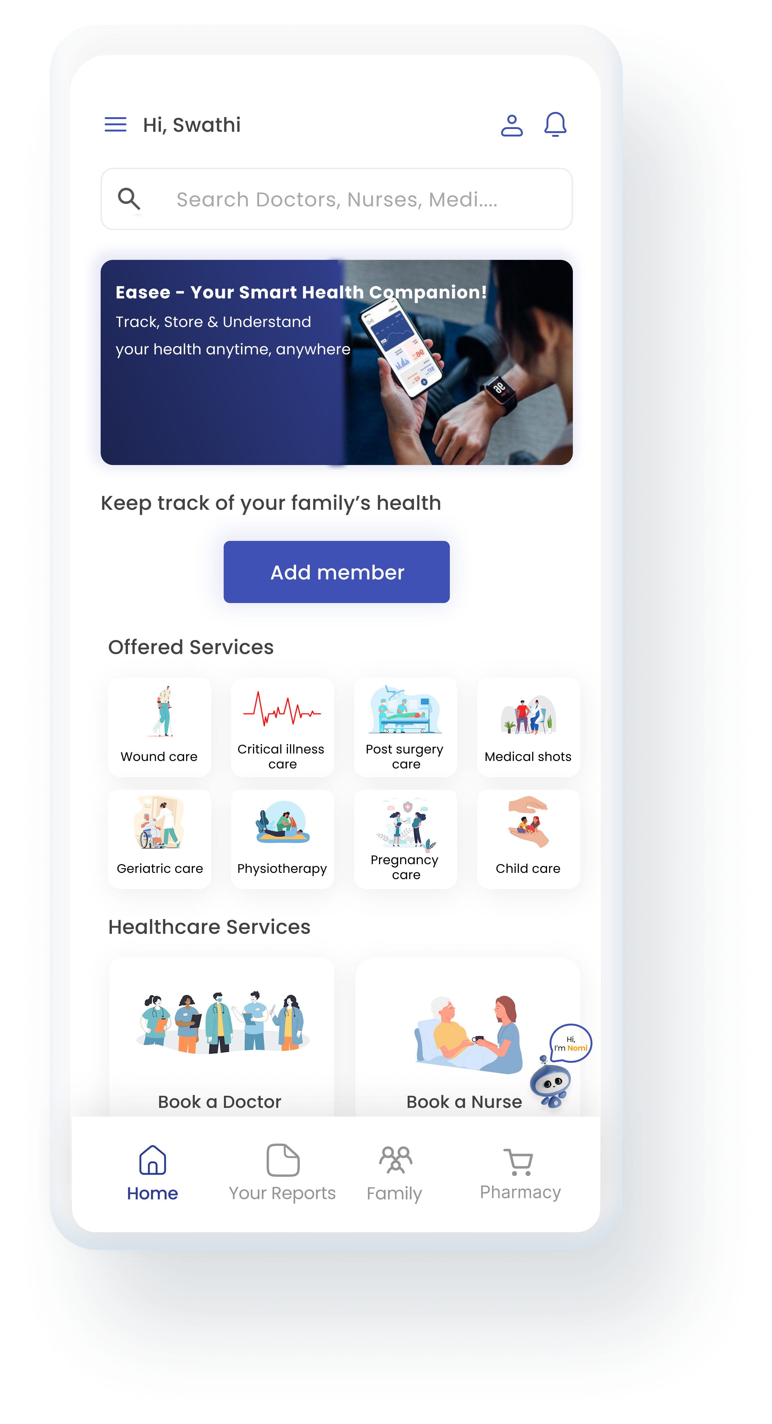
Home screen
- Add member lets families connect and follow each person's daily health and care routine.
- Offered Services help you pick the right care plan. Healthcare Services let you book a doctor or nurse when needed.
UX/UI case study
Because caring should be easy
A home healthcare app that helps families look after elders from a distance, with verified nurses, doctors and health updates in one place.
Mobile app for Android and iOS
The problem
Families struggle to find reliable, affordable home nursing for their elders. Routine care like medication, injections and wound care turns into delays, hospital trips and stress.
No real-time view of an elder's health leaves family members worried and uncertain.
Schedules are hard to track from afar, so doses get missed and complications follow.
When something happens, family who live far away or are busy cannot reach in time.
Care Ease connects families with verified home nurses and doctors, and keeps everyone informed, from booking to daily health reports.
Research
interviews with caregivers aged 30 to 60
So what: remote caregiving runs on scattered phone calls, which adds emotional stress and uncertainty.
Care24, Apollo Home Care and AlayaCare all fall short on easing the caregiver's stress.
| Care24 | Apollo Home Care | AlayaCare | |
|---|---|---|---|
| Home care services | Available | Available | Limited or missing |
| Elder-focused care | Available | Available | Limited or missing |
| Real-time health updates | Available | Available | Available |
| Family transparency | Available | Available | Available |
| Medication and care tracking | Available | Available | Available |
| Caregiver stress reduction | Limited or missing | Limited or missing | Limited or missing |
Available Limited or missing
Who I designed for

“Distance shouldn’t mean I love or care any less.”
A full-time working mother looking after her elderly mother, who lives alone in another town.
Her journey
The lowest point is the emergency. That is where Care Ease has to help first.
Caring · Responsible
Pain Guilt when she can't call
Idea Daily health tracking with reminders
Worried · Anxious
Pain Hard to find a doctor right away
Idea Instant doctor booking
Tense · Helpless
Pain Cannot be there instantly
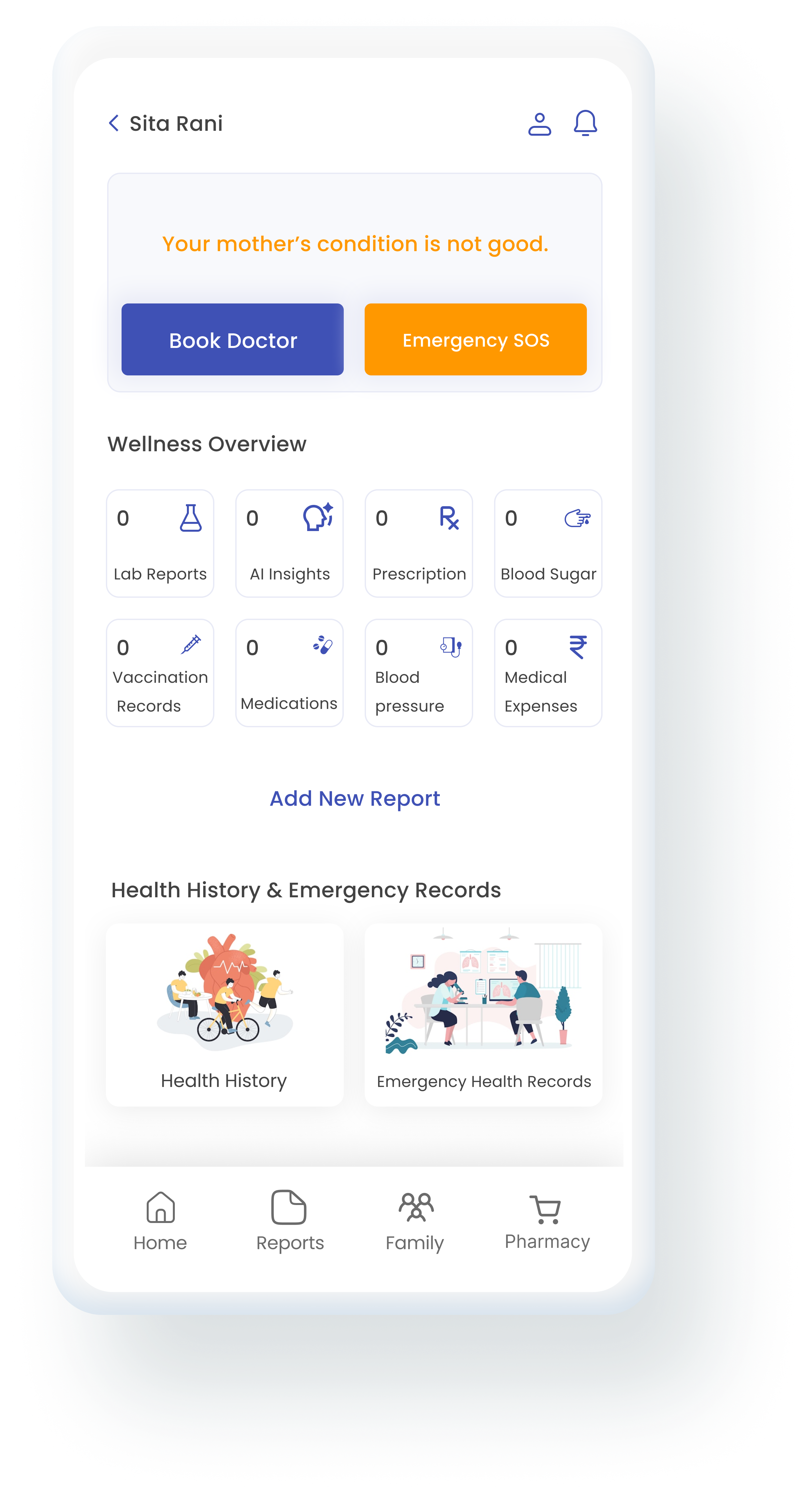
Idea Emergency SOS that alerts family and caregivers
Relieved · Thankful
Pain Fear it will happen again
Idea Health dashboard with alerts
Guilty · Confused
Pain Self-blame for not being enough
Idea A trusted nurse who sends daily reports
The solution
Each group of screens answers something Akansha said.
One home for the whole family
“Is my mother safe and healthy right now?”
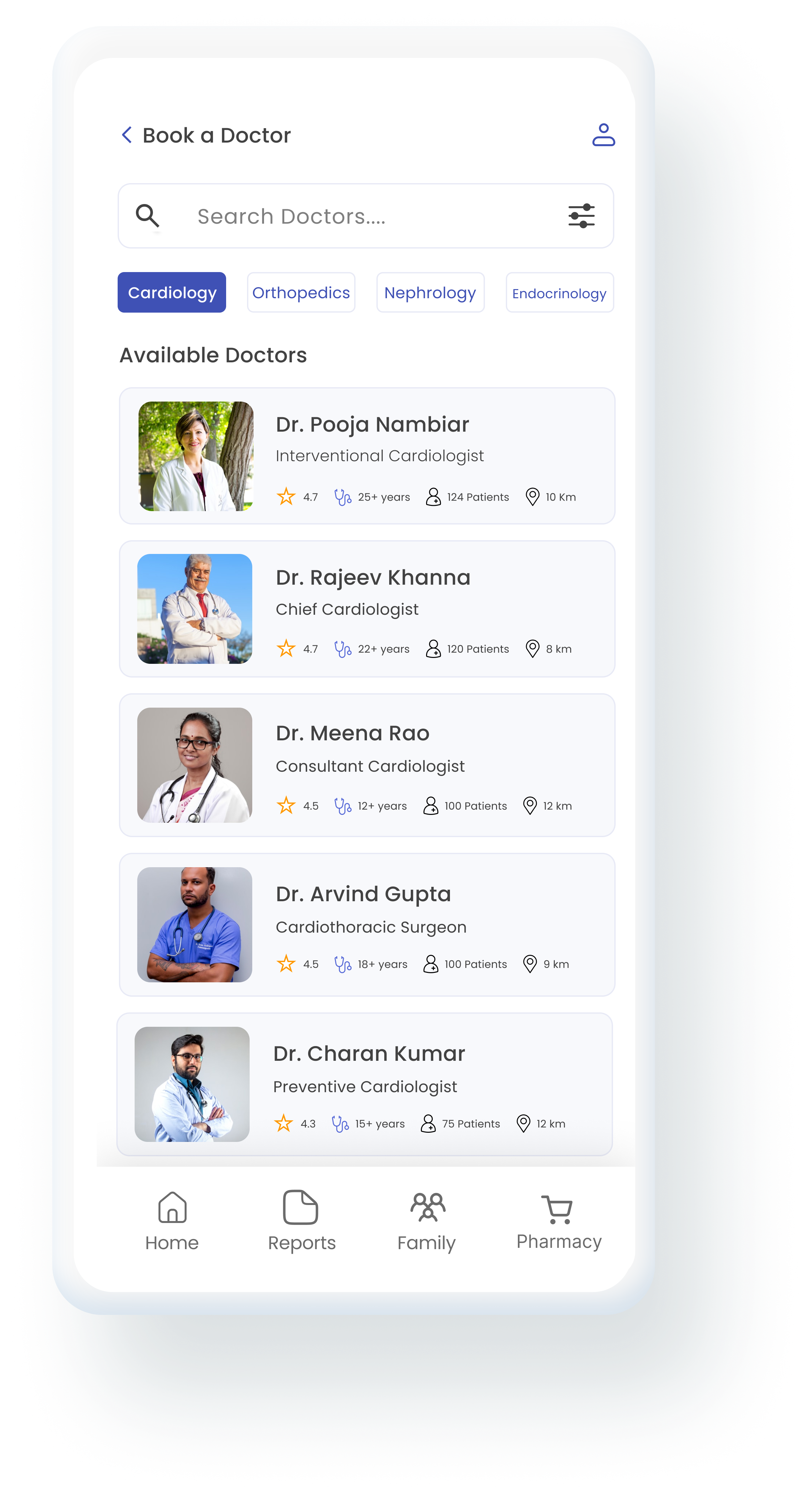
“I need a doctor quickly, but no one is available.”
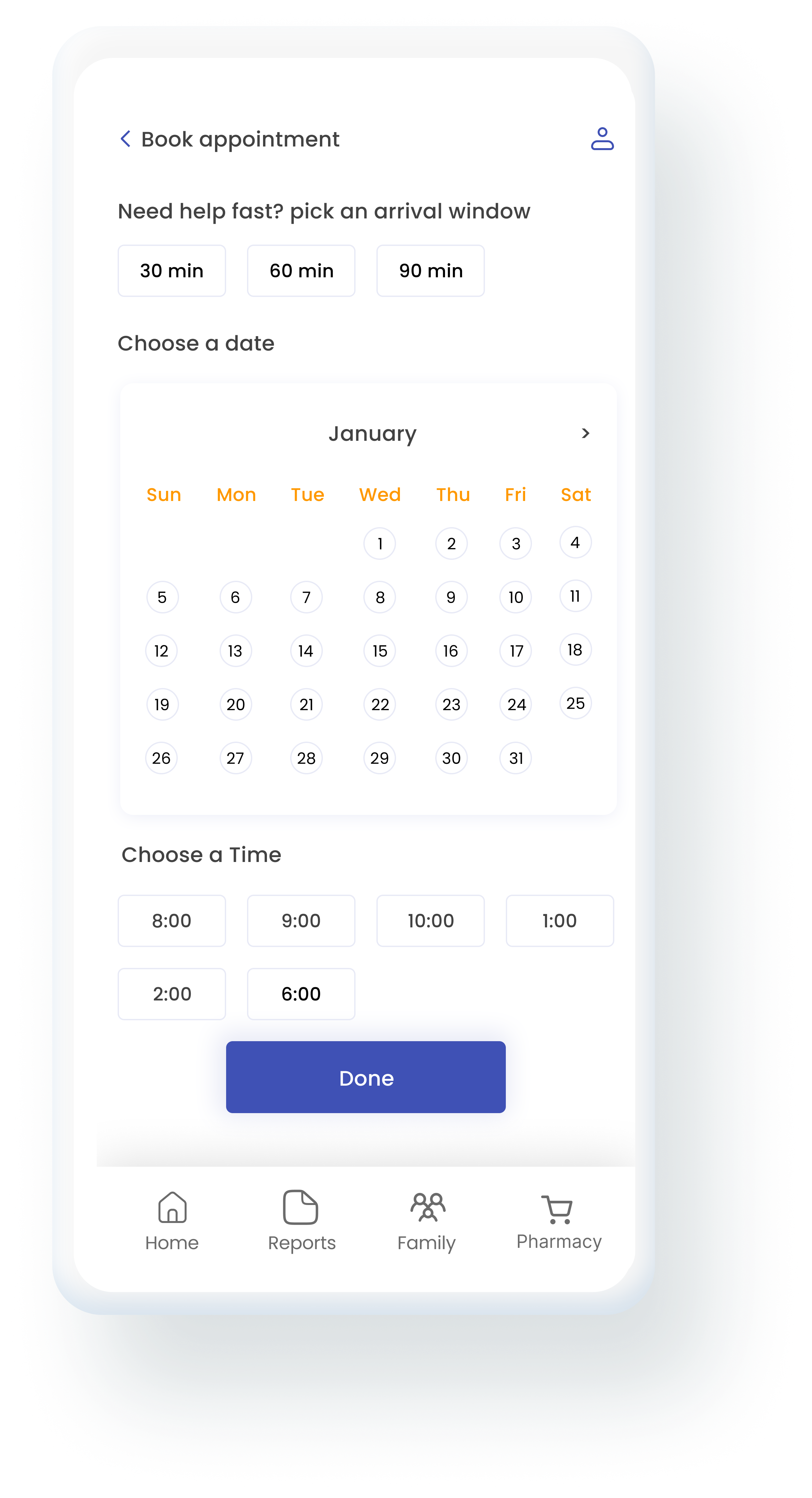
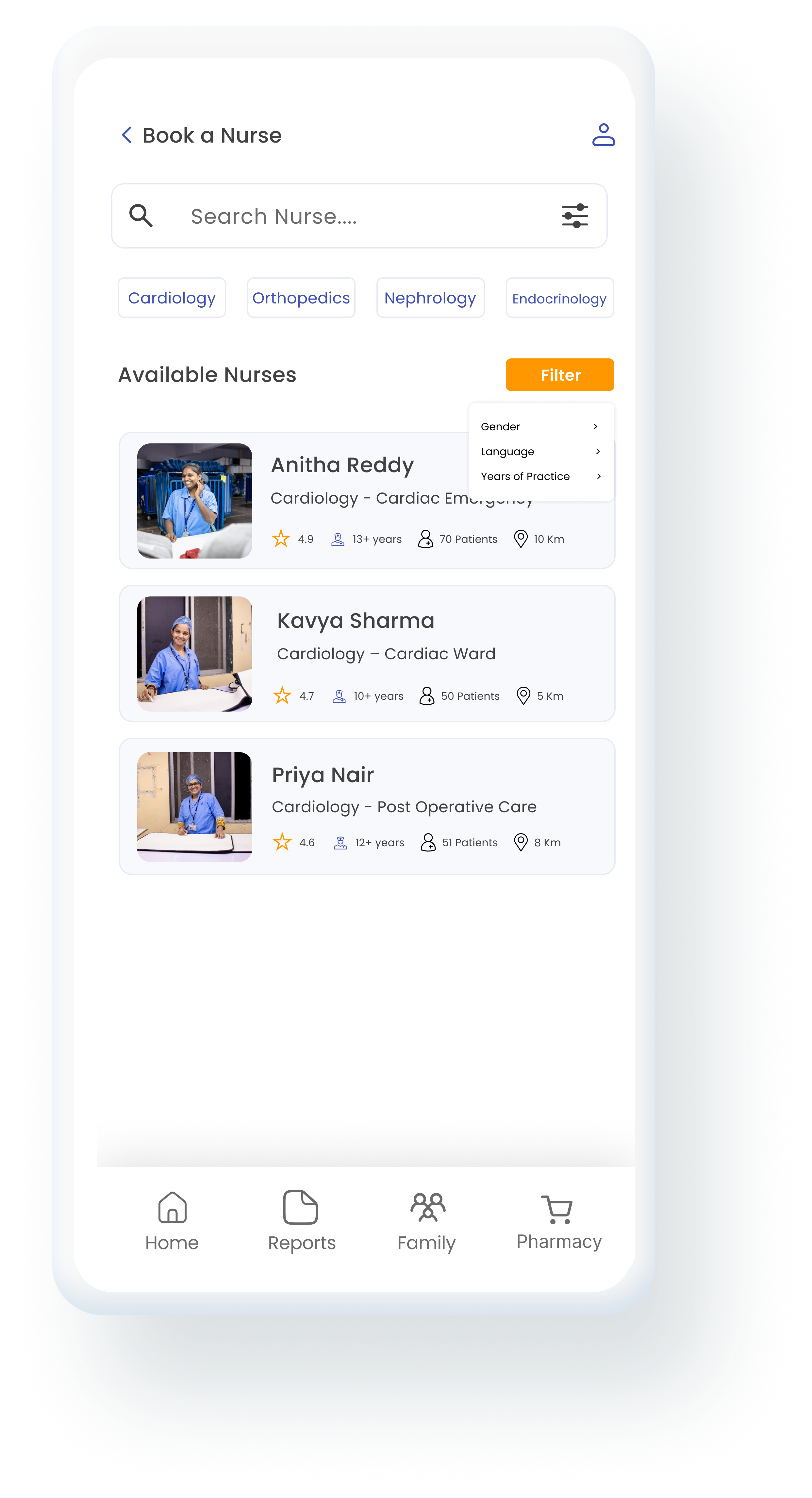
“Can I really trust caregivers from a distance?”
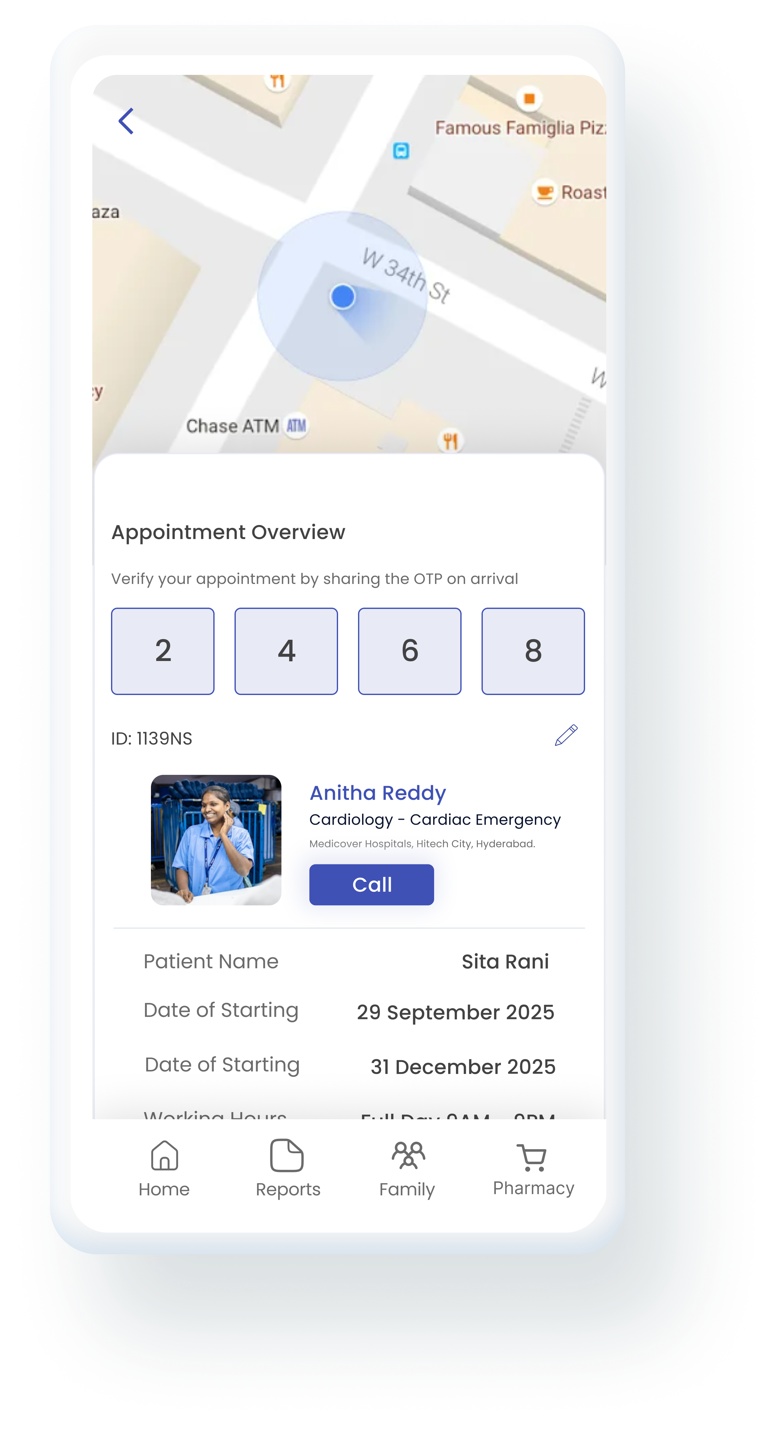
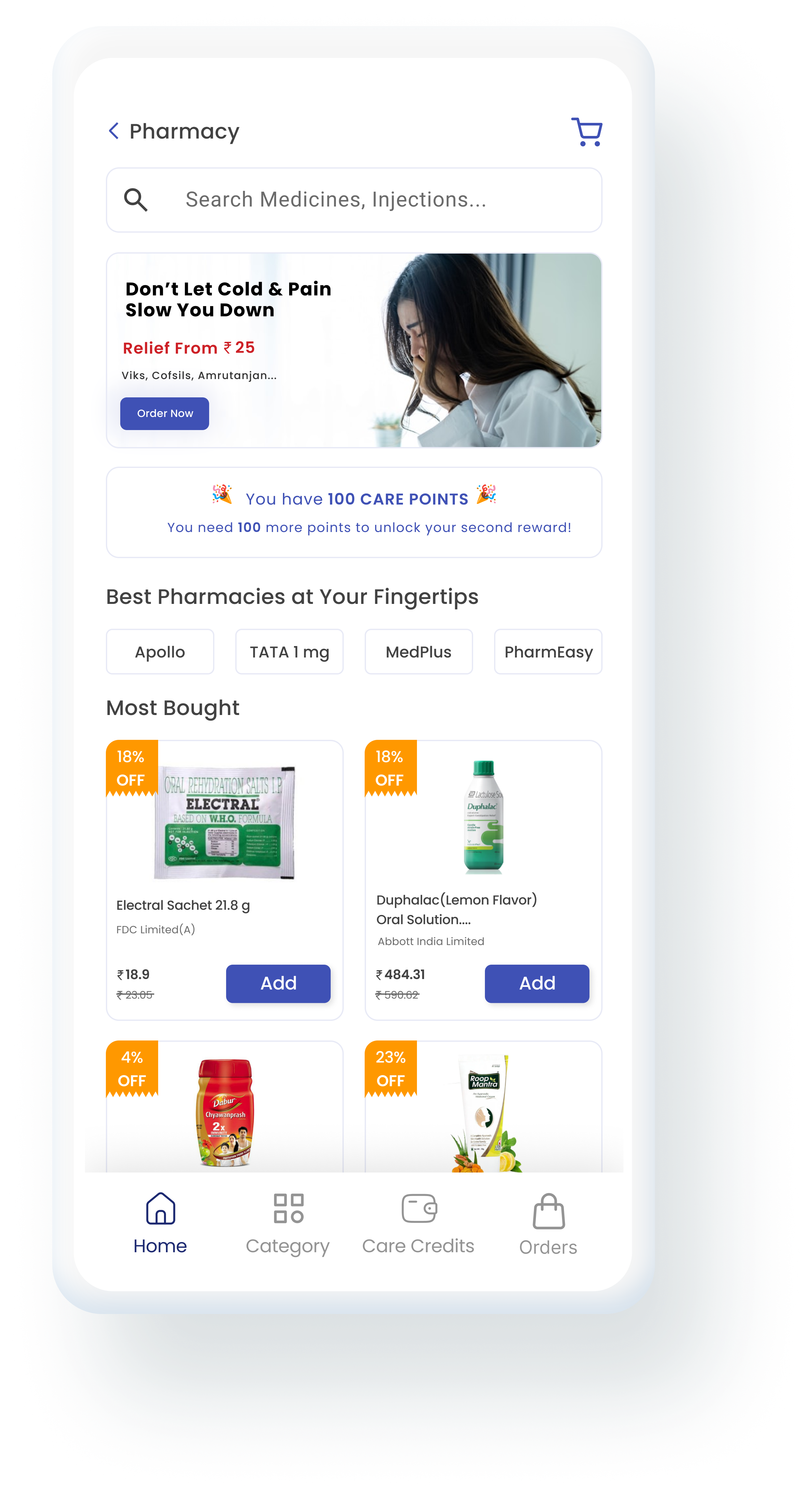
“I hope Maa is eating properly and not skipping medicines.”
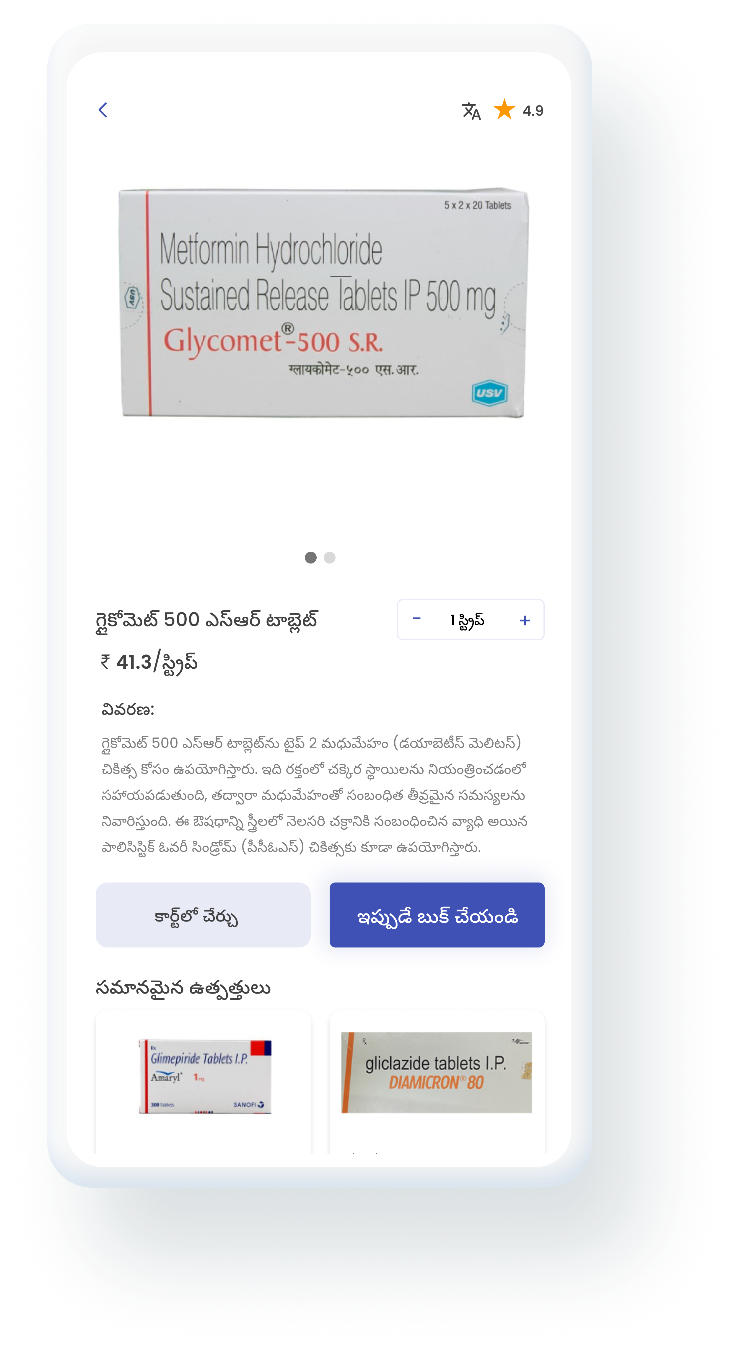
Testing
Four people matching the target audience tested these flows with guided tasks.
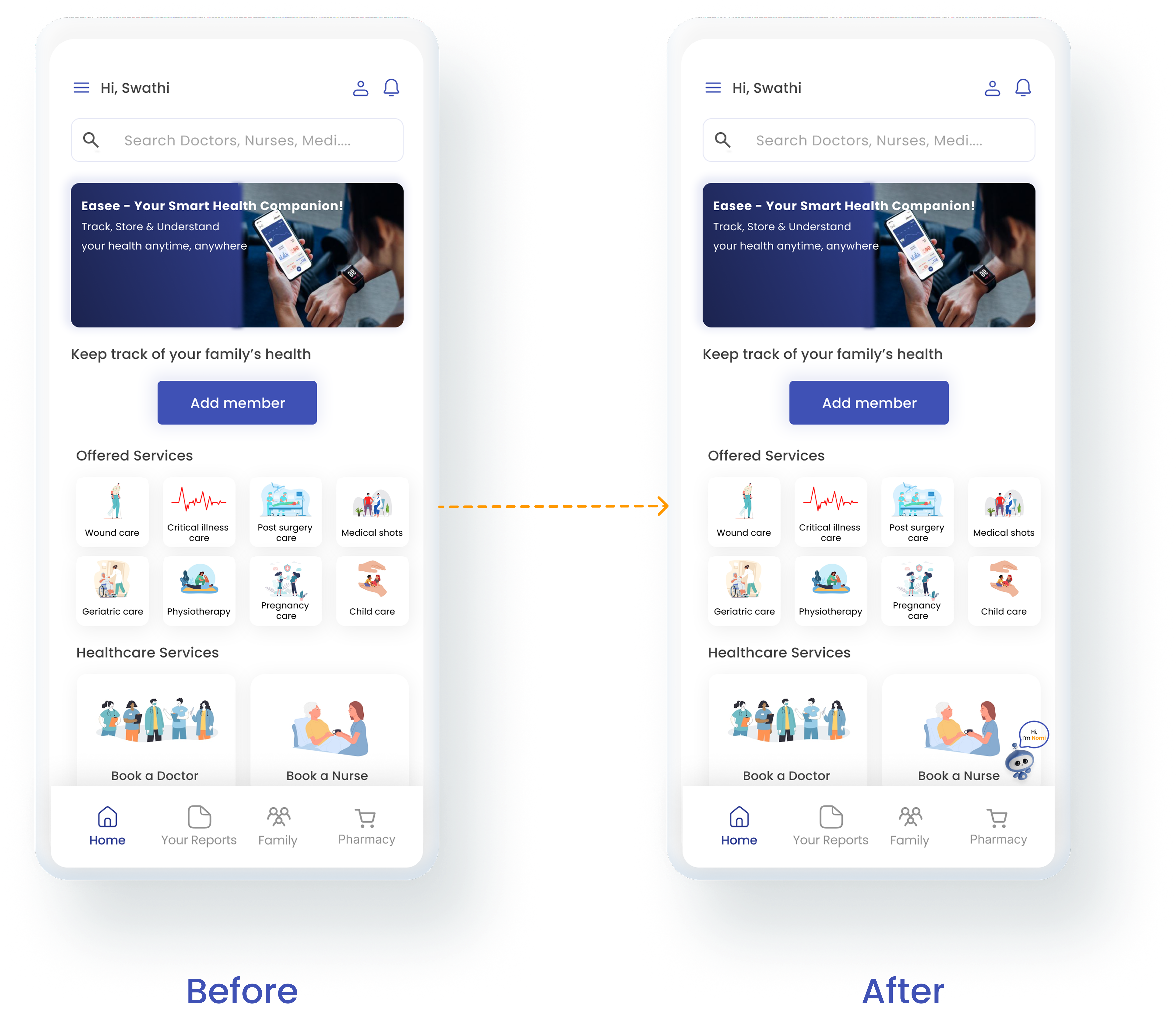
Users could not easily locate the AI tool.
Nomi, the assistant, now greets people on the home screen. Anyone who gets stuck is guided to it through clear icons and contextual prompts.
Added feature
Care Ease can listen for signs of stress, discomfort or health changes during check-in calls. It only does this when both people agree.
“Can the app notice when Maa sounds unwell, but only with her say-so?”
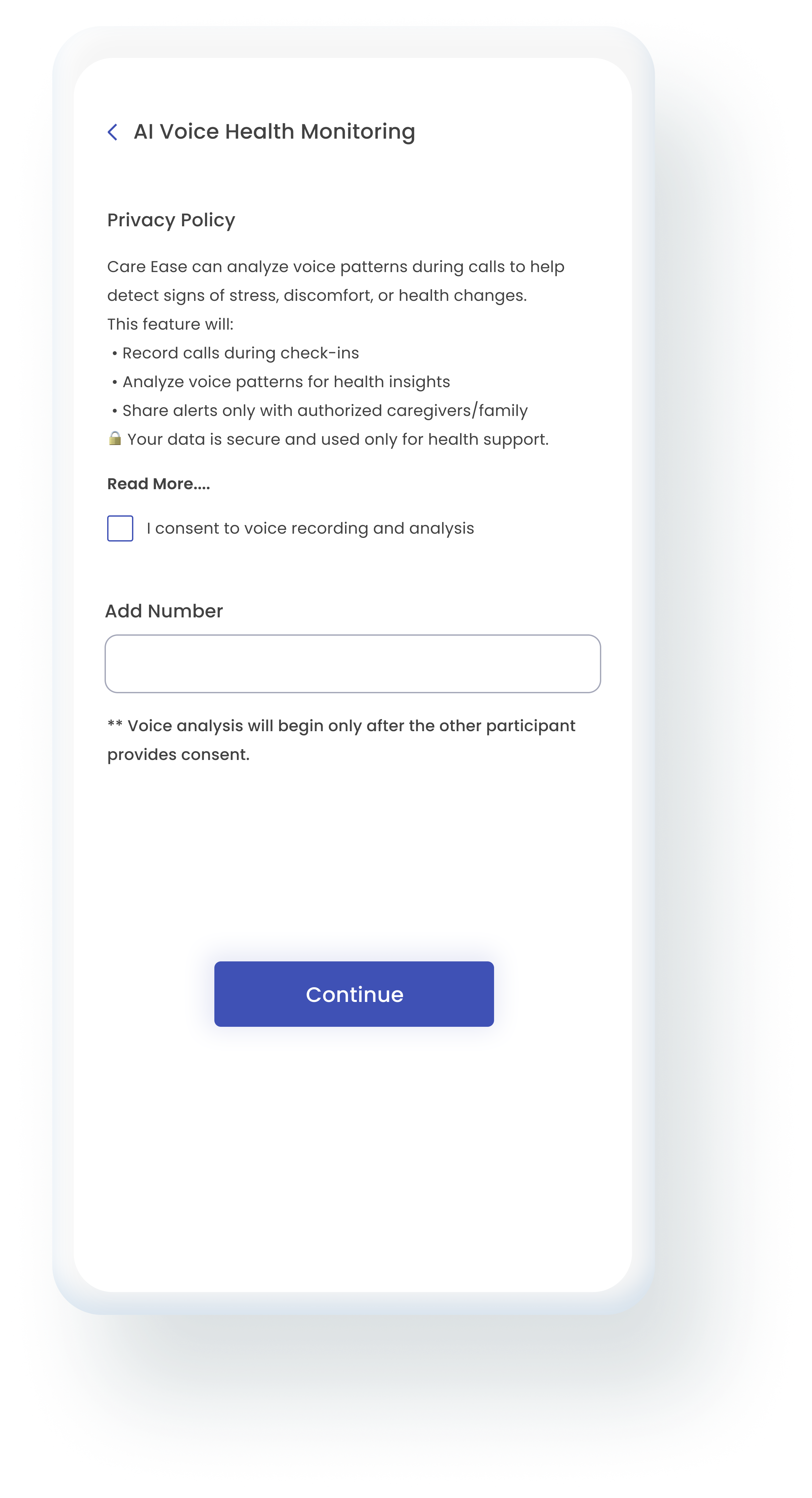
“Maa has said yes. Now it can begin.”
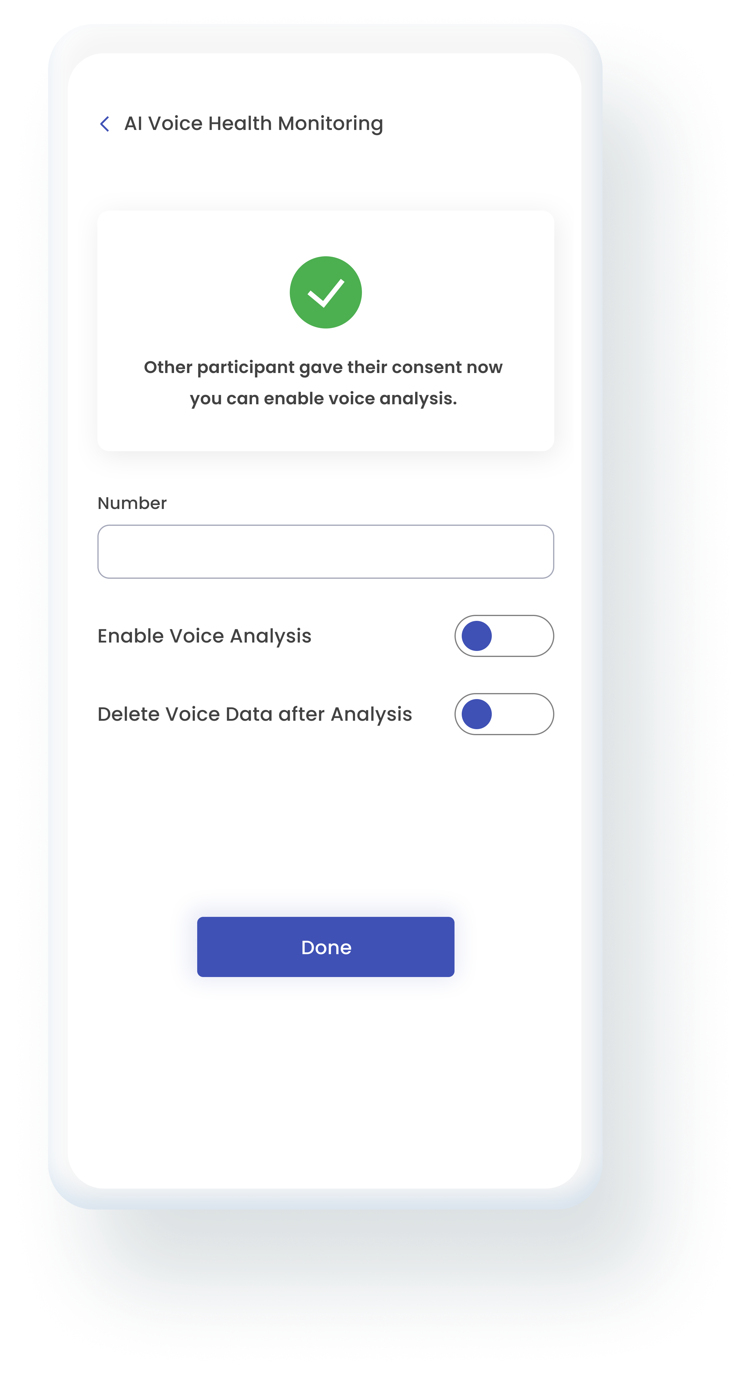
The policy is shown before anything is recorded, and nothing starts without a tick.
Analysis begins only after the other person in the call gives their consent too.
A separate switch deletes the voice data once the analysis is done.
A feature that listens to calls has to earn trust before it earns usefulness.
Design choices
Royal Indigo Trust and calm. Used for main actions.
Light Lavender A gentle, comforting background.
Warm Orange Draws the eye to key and urgent actions.
Dark Slate Clear, readable text.
Rounded buttons and cards keep the interface friendly. Indigo is for everyday actions and orange is reserved for urgency, so people never have to guess which button matters.
Poppins, 16, medium
Poppins, 14, medium
Poppins, 12, regular
Poppins, 10, regular
Poppins is clear and approachable. A 12 pt body size keeps reading comfortable for older users in different light.
Takeaways
Talking to caregivers showed what they need most: quick health updates and simple ways to act.
There were many ideas. I kept the essentials: checking health status, connecting with family and handling emergencies.
One round of usability testing showed a problem I could not see while designing: nobody could find the assistant.
Why first. How second.