


Bhahula.
Resume
TrustBite logo

UX case study · Group project

TrustBite

Making sugar easy to read

A snack-label scanner that turns confusing sugar numbers and big health claims into a clear answer, right when you are choosing what to buy.

TrustBite result screen
TrustBite home screen

Group project · Designerrs Academy · Built in Figma Make

My role

My role in the project

This was a team project, but each of us owned some parts. Here is what I did.

  • Research

    I conducted two user interviews, built my own affinity map and first personas, then fed into the team synthesis, final personas, journey maps and ideation.

  • Planning

    I independently built the user flows for each persona, merged them into one Master User Flow, and wrote the Product Requirements Document.

  • Final design

    I took the final product design forward in Figma Make, from the first idea to the high-fidelity screens.

The problem

The information is on the label. Understanding it is another matter.

Have you ever checked the sugar on a packet of chips or biscuits and still not known what the number means? Serving sizes, percentages and claims make a clear picture hard.

Is 12g a lot? CRUNCHPotato chips Low fat Nutrition Facts Total Carbohydrate19g Total Sugars12g Added Sugars9gProtein2g Natural
  • Why can’t consumers track sugar content in packaged snacks?
  • How might we help people understand sugar information and make more informed snack choices?
  • Hard to read

    A number like 12g says how much, but not whether it is okay for me.

  • Hidden under many names

    Glucose syrup, dextrose and maltodextrin are not always seen as sugar.

  • Claims mislead

    “Natural” or “Low fat” makes a product feel healthier before the label is read.

Secondary research

Understanding the landscape before speaking to a single user

We looked at how sugar information is shown, how people read it, how marketing shapes perception, and whether existing apps already solve this.

  • People check the expiry date

    One Indian study found 81% of label readers mainly checked the expiry date, not nutrition.

  • Formats help

    Research on sugar labels found confusion around total and added sugar, and that front-of-pack warnings improve understanding.

  • Tools fall short

    Existing apps focus on calories, or have gaps in Indian packaged-product data.

What we found across 10 apps

We studied sugar trackers, diabetes apps, calorie trackers and barcode scanners (Suglog, Sugcut, mySugr, Glucose Buddy, MyFitnessPal, Cronometer, Fooducate, NHS Food Scanner, Yuka and more). None combined barcode scanning, a sugar-specific score and claim checking in one place for Indian packaged products.

Research

Talking to real people about how they shop

I interviewed two people: one became sugar-aware after being told they were prediabetic, the other already tracked nutrition for fitness.

What does 12g mean?Is “natural” true?Which one is safe?
  • What we asked

    Label-reading habits, how they read sugar terms and serving sizes, how claims shape their view, and what tools they use.

  • Affinity mapping

    I grouped my own notes first. The team then merged every interview into one map with ten categories, from user pain points to trust and verification needs.

  • Why it mattered

    It moved us from single stories to shared patterns about how people judge sugar in snacks.

  1. 1 · Sugar information exists, but it is difficult to understand.
  2. 2 · People are influenced by how products are presented.
  3. 3 · Checking labels takes real time and effort.
  4. 4 · People want information they can trust and verify.
  5. 5 · Existing digital tools do not fully solve this.
The core finding

The information exists. The challenge is making it understandable, trustworthy and useful at the moment of decision.

Who I designed for

Meet Aisha, Kavita and Arjun

Three people, three reasons to care about sugar, one shared problem.

Persona photo of Aisha

“12 grams. Is that okay for me?”

  • Aisha
  • Reactive, health-driven shopper

Became sugar-conscious after a health scare. She now reads labels out of necessity, not habit.

Frustrations

  • Unsure what the numbers mean for her
  • Sugar hides under many unfamiliar names
  • Health claims make products look safer than they are

Goals

  • Know quickly if a product is right for her
  • Stay on track with her sugar intake
  • Trust what the label tells her
Persona photo of Kavita

“I just want a safe choice for everyone at home.”

  • Kavita
  • Protective household shopper

Shops for a whole family and wants every choice to be safe for each of them.

Frustrations

  • Cannot compare products quickly in the aisle
  • Does not know which front-of-pack claims to trust
  • Every family member needs something different

Goals

  • Safe choices for the whole household
  • Quick, clear comparisons while shopping
  • Information she can verify
Persona photo of Arjun

“Give me the sugar number, fast and exact.”

  • Arjun
  • Fitness-focused tracker

Already tracks macros as part of his routine and wants sugar to fit into decisions he already makes.

Frustrations

  • Apps need manual logging
  • Databases miss many Indian packaged products
  • Sugar is only one small part of most trackers

Goals

  • Sugar data that is fast to check
  • Precise numbers he can log and compare
  • A scan that works on Indian products

Their journey

Where it hurts most

The lowest point is reading and judging the label. That is where TrustBite has to help first.

  1. 1

    Intention

    Hopeful · Curious

    Pain Wants a healthier snack but not sure where to start

    Idea Barcode scanner with a health summary

  2. 2

    Searching

    Hurried · Doubtful

    Pain Finding the right sugar information takes effort

    Idea Scan once and get the answer

  3. 3

    Evaluating

    Confused · Overwhelmed

    Pain Cannot tell if 12g of sugar is a lot

    Idea Traffic light rating and plain language

  4. 4

    Comparing

    Frustrated · Unsure

    Pain Hard to compare products and trust claims

    Idea Claim vs. reality checker and comparison

  5. 5

    Deciding

    Cautious · Confident

    Pain Not sure the choice suits them

    Idea Suitability per person and better alternatives

One shared pattern

Despite different motivations, all three met the same friction: finding information, understanding sugar content, comparing products and feeling sure about the final choice.

Ideation

From How Might We questions to ideas

We turned the research problems into questions, then grouped the ideas into three parts that became the final design.

  • How might we help consumers instantly understand the actual sugar content of a product?
  • How might we make sugar information simple and easy to understand?
  • How might we help consumers verify health claims made on packaging?
  • How might we help shoppers compare healthier snack options quickly?
  • How might we prevent consumers from being misled by deceptive claims?
  • Make it easy to understand

    Traffic light sugar rating, sugar score, plain-language translation and regional language support.

  • Decide with confidence

    Claim vs. reality checker, verified health badge, product comparison and suggested alternatives.

  • Reduce the effort

    A barcode scanner that gives a health summary in seconds.

Product requirements

What the product must do

I turned user needs and ideas into five requirements in the PRD.

  1. 1 · Make sugar easy to understand: a traffic light rating and sugar score.
  2. 2 · Simplify nutrition information: plain language and regional language support.
  3. 3 · Help users verify claims: a claim vs. reality checker and verified badge.
  4. 4 · Reduce effort while shopping: a barcode scanner with a health summary.
  5. 5 · Support better comparisons: product comparison and suggested alternatives.

Final design

Meet TrustBite

TrustBite brings product information, sugar insights, claim checking and personalised suggestions into one experience.

“What’s really inside your food?”

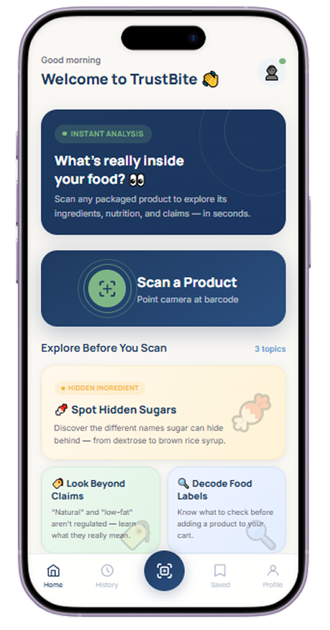
01 · Start with a product

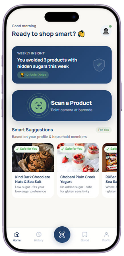
  1. The home screen leads with one big action: Scan a Product.
  2. Explore Before You Scan teaches hidden sugars, claims and label reading.
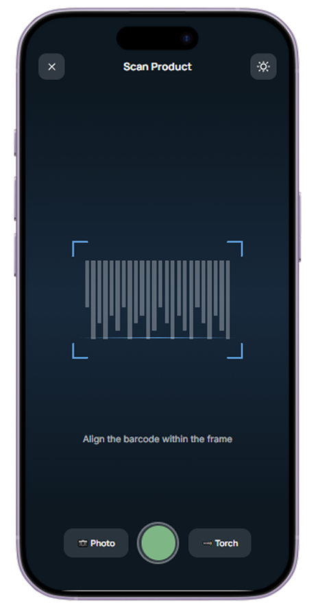
  3. The scanner asks only for the barcode to sit inside the frame.
TrustBite home screen
TrustBite scan screen

“Is this snack really what it says?”

02 · Understand the results

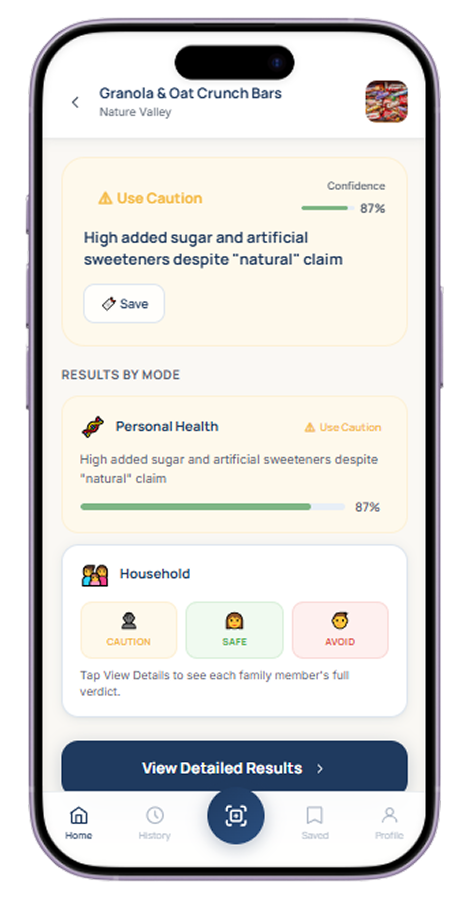
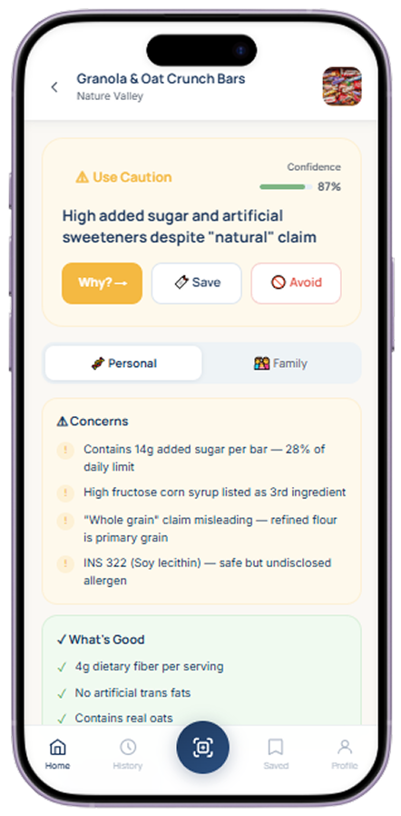
  1. A clear verdict, here “Use Caution”, comes first, with a confidence score.
  2. Concerns and What’s Good are listed in plain words, such as high added sugar despite a “natural” claim.
  3. Results can be viewed for personal health or for the whole household.
TrustBite result screen
TrustBite detail screen

“Is this right for my family?”

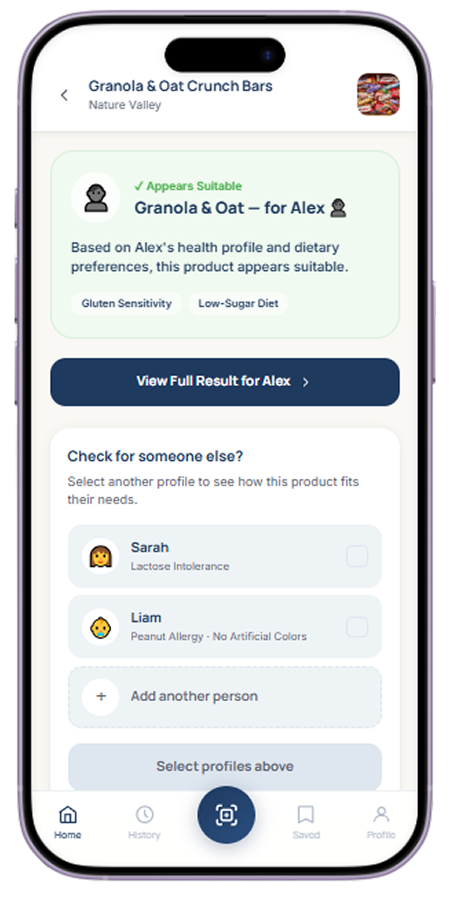
03 · See what suits you

  1. The product is checked against a person’s health profile and dietary needs.
  2. Other family profiles can be selected to see how the same product suits them.
TrustBite suit screen

“Show me something better.”

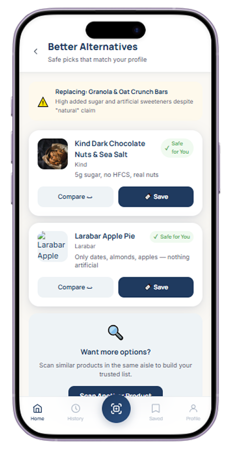
04 · Explore better choices

  1. Smart Suggestions on the home screen are based on the profile and household.
  2. Better Alternatives shows safe picks next to the product they replace, with Compare and Save.
TrustBite suggest screen
TrustBite alt screen

Design choices

Calm, clear, easy to read

A deep navy and warm ivory base for credibility and calm. Sage green, amber and red carry the traffic light logic through every screen.

Colour with a job

Sage green Safe for you.

Amber Use caution.

Red Avoid.

Verdict first

Each result opens with one clear verdict and a confidence score. The detail follows, so nobody has to decode numbers before getting an answer.

One clear action

The home screen leads with a single big action, Scan a Product, and the scanner sits in the middle of the navigation bar on every screen.

Trust Primary#1F3A5F
Soft Blue#5B9BD5
Sage Green#7FB685
Warm Ivory#FAF8F4
Mist Gray#EEF3F6
Slate Gray#5B6573
Success#4CAF50
Warning#F4B942
Error#E1564A
Information#6C63FF

Headings · Manrope SemiBold

Making sugar easy to understand

Body text · Inter Regular. Manrope’s rounder, confident headlines pair with Inter’s clear body text, because so much of this product’s job is making dense nutrition data easy to scan.

Takeaways

What I took from it

This was a group project across research, synthesis, ideation and product design. My own work centred on research, persona-based flows and the final product.

  • Research feeds design

    Individual research became a shared direction, and flows and a PRD connected it to the screens.

  • Make it understandable

    A number alone does not help. A clear verdict does.

  • Trust must be earned

    Verifying claims is as important as showing data.

My biggest takeaway

Information is only useful when people can understand it and act on it.

Know before you eat

Why first. How second.